Dropdown Select Pattern
Dropdown Select enables you to implement a search functionality or multiple selection in lists. You have to bind it to a main widget.
When to use
Use the Dropdown Select when you need an enhanced combo or list box in forms, as it offers a richer user experience than lists.
How to use
To add Dropdown Select to your application, follow these steps:
-
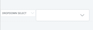
Place Combo Box or List Box in the main editor. This is your main widget.
-
Make sure your enter a value in the Name property of the main widget.
-
Drag DropdownSelect pattern into the preview next to your main widget.
-
Set the mandatory value
WidgetIdin the properties pane that corresponds to the main widget. -
Adjust the widget width by adjusting the width of the outer container.
How this pattern behaves depends on the way it's bound.
- If you bind it to a Combo Box widget, DropdownSelect works as a selectable Dropdown.
- If you bind it to a List Box, DropdownSelect works as a multi-select with removable tags.
Input Parameters
| Input Name | Description | Type | Mandatory | Default Value |
|---|---|---|---|---|
| WidgetId | Element Name (Combo Box and List Box) that triggers the element to be visible. | Text | True | none |
| NoResultsText | Text to display when there are no results. | Text | False | "No results found." |
| SearchEnabled | If set to false, removes the search functionality. | Boolean | False | True |
| SearchResultsLimit | Limit number of results shown. | Long Integer | False | 10 |
| AdvancedFormat | Enable more options beyond what's provided through the inputs. To find more options go to Choices library. Example: { searchPlaceholderValue: 'Search' } |
Text | False | "{}" |
Layout and Classes

CSS Selectors
| Element | CSS Class | Description |
|---|---|---|
| Dropdown | .choices__list--dropdown.is-active | Defines if the drop-down is closed or opened |
Examples in Screen Templates
The following Screen Templates use the this pattern:
- ListWithFilters
- ProductDetail
- SimpleForm
- ThreeColumnGallery
Advanced
Here are some examples of more advanced settings for the pattern. Make sure to check which colors are available.
Change border-color
Write the following CSS in the CSS editor and change the yourcolor variable:
.choices__inner {
    border: var(--border-size-s) solid yourcolor;
}
Or using the CSS variable var(--color-yourcolor) example:
.choices__inner {
    border: var(--border-size-s) solid var(--color-yourcolor);
}
Change removable tags color
Write the following CSS in the CSS editor and change the yourcolor variable:
.choices__list--multiple .choices__item.choices__item--selectable {
    background: yourcolor;
}
Or using the CSS variable var(--color-yourcolor) example:
.choices__list--multiple .choices__item.choices__item--selectable {
    background: var(--color-yourcolor);
}
Examples in browser
With Combo Box:

With List Box:
