RangeSlider Pattern
The RangeSlider pattern allows you to set a value by dragging a handle within a configured range. It is used to control a variable value with simple and interactive user input.
How to Use the RangeSlider Pattern
Bind your variable to the InitialValue input and use the OnChange event to add your logic to handle value changes.

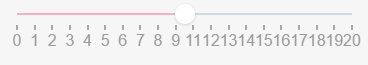
1. After setting the MinValue , MaxValue and the InitialValue , you'll need to create the OnChange event.

2. Create an integer value and assign it.

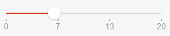
Result:
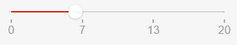
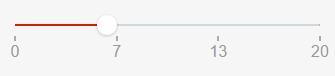
Changing the Color of the Bar

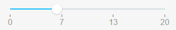
Changing the Size of the Handles

Input Parameters
| Input Name | Description | Default Value |
|---|---|---|
 MinValue MinValue |
Slider's minimum value. | none |
| MaxValue |
Slider's maximum value. | none |
| InitialValue |
Value selected by default. Must be between min and max values. | none |
| Step |
Slider moves in increments of Step. If Step is 10, the slider will go from 0 to 10, to 20, to 30, etc. | 1 |
| ShowPips |
Show pips below the slider. | True |
| PipsStep |
Range interval after which a Pip is drawn (when ShowPips is enabled). If not specified, the component will try to guess what step fits your data. | -1 |
| ChangeEventDuringSlide |
Triggers Change events while the slider is being dragged. If set to False , the Change events will only be triggered when the user releases the slider. Tip: If you're refreshing a query based on the value of the slider, you probably want to set this to False . | True |
Events
| Event Name | Description | Mandatory |
|---|---|---|
 OnChange OnChange |
Action to execute after selecting a new value on the slider. Returns the new Value. | True |
Layout and Classes

CSS Selectors
| Element | CSS Class | Description |
|---|---|---|
 noUi-handle noUi-handle |
.noUi-active | Class added when handle is clicked. |
Samples
This sample uses the RangeSlider pattern:
